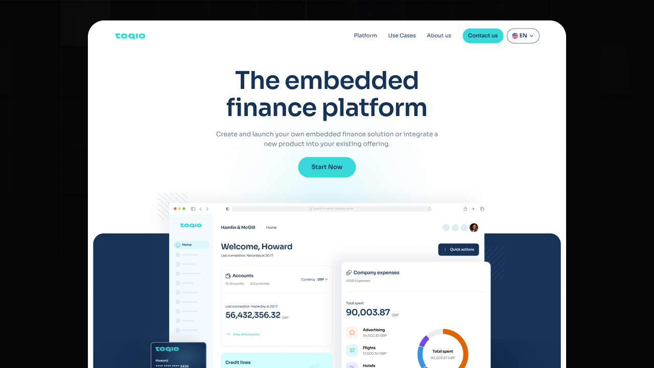
Is your website making a strong first impression? The top section of your homepage is a make-or-break area that can significantly impact user engagement. In this month's makeover, we delved into enhancing Toqio's homepage hero section to demonstrate key improvements that can elevate your website's aesthetics and functionality.
Why the Homepage Hero Section Matters
Your homepage's hero section is often the first thing visitors see when they land on your site. It serves as a digital storefront, inviting users to explore further or prompting them to bounce away. To make this section effective, it needs to be visually appealing, user-friendly, and align with your brand's messaging.


UX and UI Enhancements for Toqio
Here's a breakdown of the UX and UI improvements we implemented for Toqio's homepage hero section:
Clarity
The revamped design features a bold header that succinctly conveys the platform's purpose, ensuring visitors immediately grasp the core offering.
Call-to-Action (CTA)
By changing "Contact us" to "Start Now," we created a sense of urgency and a clearer pathway for users to engage with the platform.
Structure
The redesigned layout guides users seamlessly from the headline to the CTA button, creating a logical flow that enhances user experience.
Credibility
Including client logos in the new design lends credibility to Toqio, showcasing established partnerships and reinforcing the platform's reputation.
Contrast
A vibrant CTA color in the updated layout grabs attention and stands out against the background, prompting action from visitors.
Typography
Uniform text size and weight enhance readability, ensuring that key messages are easily digestible for users.
Imagery
Enlarged product shots in the new design aid in quick interface recognition, facilitating user understanding and engagement.
Whitespace
Increased spacing in the redesign reduces clutter, allowing essential elements to breathe and capture users' attention effectively.
Balance
The harmonious blend of text and visuals in the updated layout creates a visually pleasing and balanced composition.
Branding
Consistent application of logo and CTA hues reinforces Toqio's brand identity, fostering brand recognition and recall.
Navigation
A streamlined menu in the new design simplifies user navigation, making it easy for visitors to explore the site and find relevant information.
Is Your Website Ready for a Refresh?
Your website's first impression matters. If your homepage hero section is in need of a refresh, consider the key elements that can enhance user engagement and drive conversions. Reach out to our team at Jords+Co for expert web design, UX/UI, and branding services.


